Sorcerer - Imperial College Operatic Society, 2000

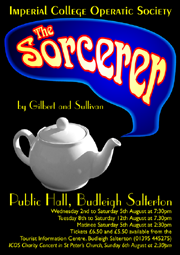
The brief for this poster was very simple: to come up with a striking image, that would stand out clearly in the shop windows of Budleigh Salterton, East Devon, and which captured something of the mystery of this early Gilbert & Sullivan show, in which a sorcerer is engaged to make all the boys and girls in a village fall in love. He does this by slipping something into the tea at the village fete ...
A high-contrast colour scheme, involving a jet black background with white and yellow lettering, contrasted with dramatic flashes of blue and red in the stylised image, was chosen for its visual impact. The resulting poster worked very well, and stood out clearly amongst the myriad other material found on assorted pub walls, shop windows and library information boards.
Creating the Poster
Using a low resolution (0.75 megapixel!) camera, a picture was taken of a "Chatsford" teapot, originally bought from Whittard of Chelsea.
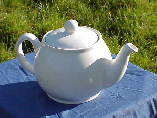
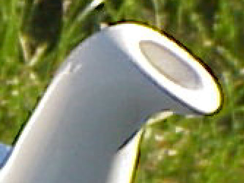
Close up, the picture was very "dirty", with distinct jaggies, over-sharpened edges and burnt-out highlights.
A smooth-edged mask was carefully prepared in Photoshop, using a variety of tools.
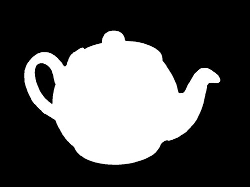
The mask was applied to the teapot, removing the background grass and table cloth, and the resulting "clean" teapot was modified with Photoshop's "dry brush" filter to remove pixelation and give the pot something of a "painterly" feel.
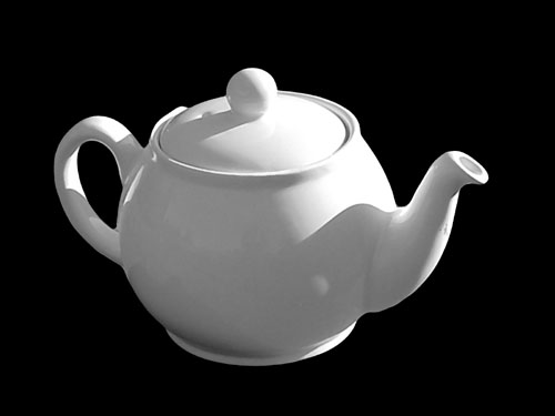
This image was imported into CorelDRAW, resized, and the "steam" and lettering added, resulting in the final design, which was exported as a high-resolution TIFF file in CMYK format for professional production by a local print shop.
Promotional Clothing
As well as the poster, leaflets, newspaper advertisements and other printed material, all of which required adjustments to the layout or colour scheme, the company requested the supply of customised T-shirts, polo shirts and other promotional clothing items for its members.
A reduced-colour version of the logo was prepared in CorelDRAW, with simplified lettering.
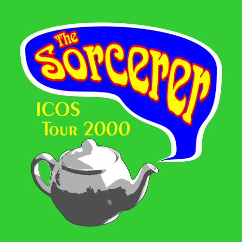
This logo was scanned by a local clothing company, and used to program a stitching machine to create sewn-on badges for the higher-end clothing items.
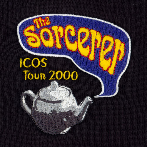
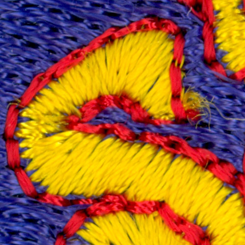
The specialised logo required five colours of thread, and many thousands of stitches.
For printing on cheaper T-shirts, a monochrome version was created, and was printed in gold onto dark green fabric.
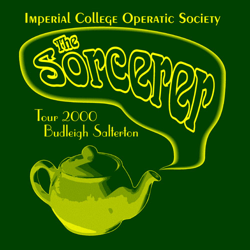
Because only one colour could be used in the printing, the shading effects were created using a coarse halftone mask.
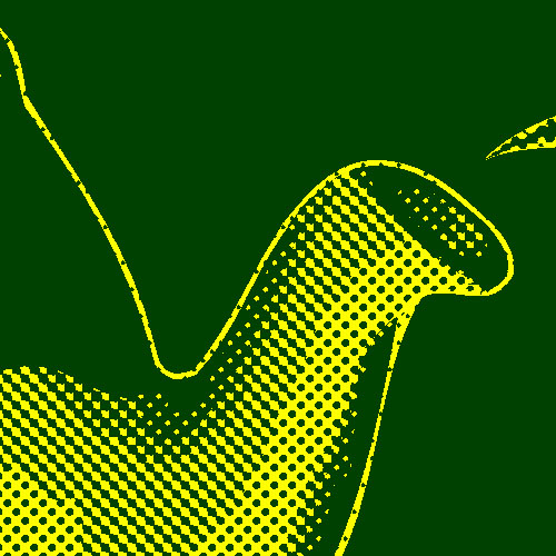
Production was split between the "sewn-on badge" items, which included polo shirts, spaghetti-strap tops, sports shorts and sweat shirts, and the cheaper, printed T-shirts. All items were sold to the cast during the two-week "Tour" in Devon, though it was noted that the sewn-badge items, despite costing more, we the first to sell out!
Click on the links below to find out about some other poster designs:
