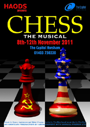
CHESS The Musical - Horsham Amateur Operatic & Dramatic Society, 2011

Right from its initial inception, the poster for "CHESS The Musical" was envisioned as a being slightly sinister image, in which two chess pieces, one representing the USA and the other, the USSR, would stand menacingly alongside each other on a chess board which faded into the distance. The only question was, how best to achieve the desired image? As it turned out, this was one of the most complicated projects to date.
Creating the Poster
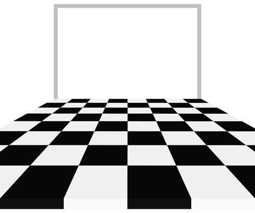
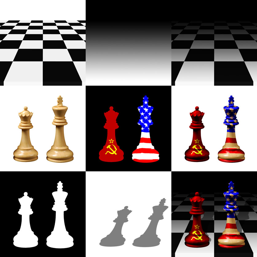
The chess board was prepared using CorelDRAW!: a grid of 64 white and black squares was drawn, and then treated to a perspective envelope to give it the effect of stretching into the distance. A lower edge of black and white rectangles was added to give the "front" a solid, three-dimensional feel, and a grey cropping frame was added for reference and alignment of other image components in the later stages of production.
Google was used to search the web for images of chess pieces, and among the various "Staunton" sets was one that was deemed suitable.
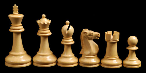
The King and Queen from the set were chosen for use on the poster, but there were two problems: firstly, the latter piece was partially masked by the Bishop, and was missing part of its base; secondly, because these pieces were at the edge of the original photograph, they were distorted and leaning towards the left.
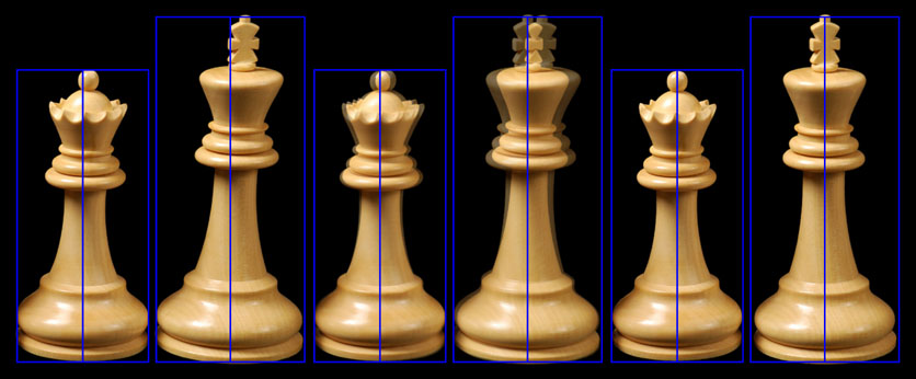
The base of the Queen was repaired by cloning, reversing and overlaying part of the base of another piece, and then both King and Queen were flipped horizontally, so that the light appeared to come from the top left, rather than top right. Finally, a pair of upright reference frames was drawn in CorelDRAW!, and used as guides while the King and Queen were independently straightened up using Photoshop's "Free Transform" tool.
With both pieces now upright and free from distortion, the next stage was to "paint" them with images based on the American and Soviet flags. Appropriate clip-art was located with Google, and the images were downloaded from the web.
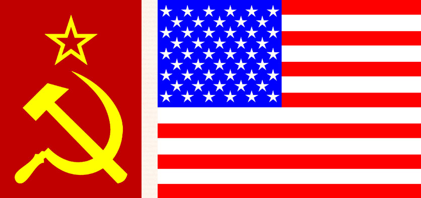
In order to make the flag images appear to wrap around the chess pieces in a three-dimensional fashion, two high-contrast monochrome images of the chess pieces were prepared using their respective blue channels, and saved independently as Photoshop files. The flag images were then opened and resized and cropped/extended as required, after which Photoshop's "Displace" filter was used to distort them relative to the monochrome chess images.
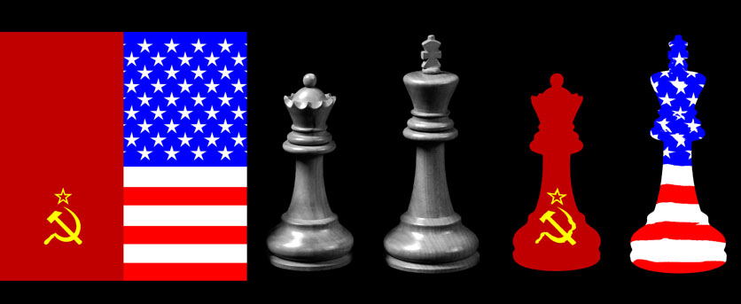
The distorted flags were then applied to the coloured chess pieces, using an assortment of combination modes and specific layers, to give the effect of being painted with woodstain and varnish.
Now looking solid and three-dimensional, the painted chess pieces required long shadows, stretching into the distance, to complete the effect: these were created by taking the outlines of the two chess pieces, and distorting them with Photoshop's "Free Transform" tool, before applying a "Gaussian Blur" to make their edges fuzzy, and setting them to 50% transparency so they that appeared grey against the chess board.
Finally, the various elements were brought together: the board was combined with a black-to-white fountain fill layer mask, so that it would fade into the background, and the painted chess pieces and shadows were overlaid, to produce the finished image.
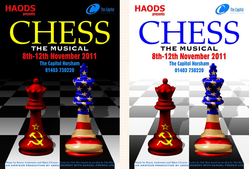
Lettering was added using "Zapf Calligraphic" and Bitstream "Copperplate" for the words, "CHESS" and "The Musical" respectively, closely matching the fonts used in current official publicity for the show, and these fonts, together with Bitstream "Gothic Condensed" were used for the remainder of the text on the design.
It was decided to print two variations of the "CHESS" poster, one in black, as originally envisaged, and one in white. For the latter, all that needed doing was to invert a black Photoshop layer, as well as the colours of "CHESS The Musical", and to copy the layer mask from the chess board to the shadows, so that they too would fade into lightness. Side by side, or even better, in arrays of multiple posters, the black and white images together suggested elements of the chequerboard.
Teamwear Clothing
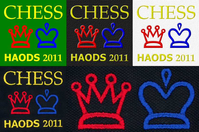
For such a wonderful musical, it was decided to design and commission "teamwear" for the cast, in the form of embroidered tee and polo shirts, in both black and white. The poster design was considered too complex for embroidering, so a simplified logo was created, showing just the words, "CHESS" and "2011" in "Zapf Calligraphic", and "HAODS" in "Tahoma Bold", all in bright yellow, together with King and Queen characters from the Adobe "Cheq" font, in blue and red respectively. The simple artwork was mocked up to simulate the embroidery on black and white garments, before an order for over 50 items was prepared and sent off for production. The final clothing, which was delivered within a week, looked very smart, and matched the original design well.
Click on the links below to find out about some other poster designs:
