Kiss Me Kate - Horsham Amateur Operatic & Dramatic Society, 2010

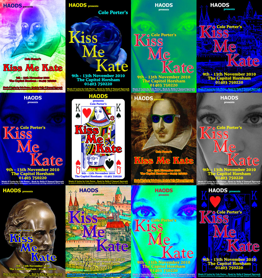
More than for any show to date, a great diversity of candidate designs was created HAODS' 2010 production of Kiss Me Kate: plays on the image of William Shakespeare, the Queen of Hearts, an early woodcut of Padua, and even a close-up face shot of the show's leading lady, led to over a dozen design prototypes.
Creating the Poster
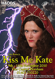
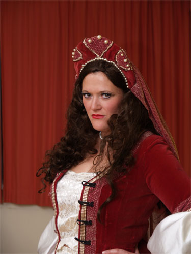
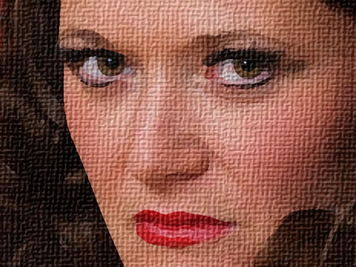
Despite publishing the above designs on the company's private website, no concensus could be attained on any one design, so it was decided to have one more go at producing a memorable image for the poster. Our leading lady was dressed in one of her costumes, made up and given a wig, and then sat for an impromptu photo shoot. Out of the 20 images taken, one in particular had a particularly enigmatic expression.
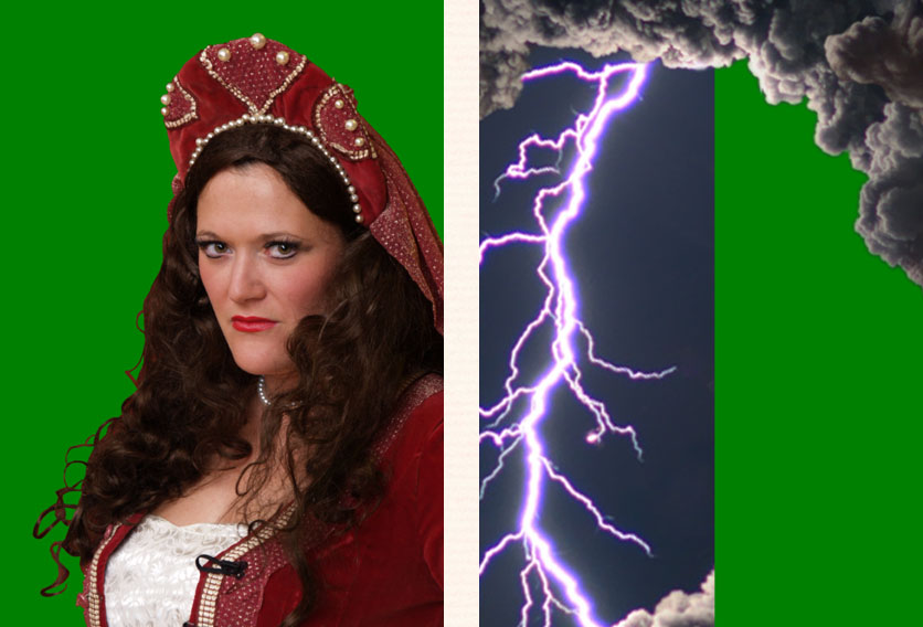
One strand of hair was lying distractingly across the forehead, and Photoshop's "Healing Brush" was used to remove this, before the "Magnetic Lasso" was employed to isolote a head-and-shoulders crop of the photo from the background. In order to emphasize the fiery nature of the character, "Kate", it was decided to set this crop of the image against some dramatic lightning effects.
Next, Photoshop's "Dry Brush" art filter was applied, to give the photograph a more painterly look, followed by application of a canvas texture. Finally, the image was signed, to complete the illusion of this piece being a painted work, and the informational show lettering was added, using the Goudy Handtooled and Goudy Old Style typefaces.
Click on the links below to find out about some other poster designs:


